UX / UI / CRO
B2B SaaS
Cierpa Kaizen
It explained everything. And sold nothing.
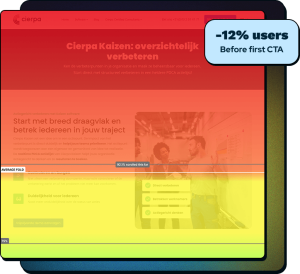
The Cierpa Kaizen page described every feature in detail, yet 83% of visitors left before they could answer the two questions that decide a B2B purchase: what is this, and is it for me. B2B SaaS product page redesign: Research, a full rebuild, and validation without a single A/B test took the demo click-through from 2.27% to 20.83%.
Measured over matched before and after windows (May–Jul baseline, Jul–Sep post-launch) using a funnel baseline I preserved manually. Traffic is low, so the rate is read alongside the mechanism behind it: deeper scrolling on every section and a measurable change in behaviour, both shown below.
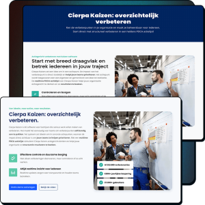
Same product. A page that finally explains it.
Our B2B SaaS product page redesign took the request demo CTA from 2.27% to 20.83%

Feature-speak copy
10 USP blocks
No product visible
CTA below fold
")
Outcome-led copy
4 merged USPs
product shown
Demo CTA in first fold
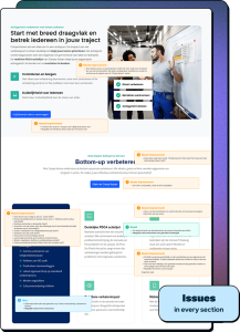
The page said too much, but explained too little.
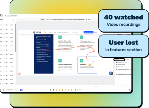
Demo click-through sat at 2.27%. Research pointed at three causes, not one.
Six methods, one conclusion, before a pixel moved.
This was not redesign-and-hope-for-the-best. Every later decision traces back to one of these.
From what it does, to what it does for you.
The original page told users what Cierpa Kaizen does. The rebuild told them what they get. Same facts, rewritten to land.
Three decisions, not eleven sections.

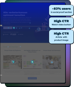
First test version showed a phone only and users assumed Kaizen was just a mobile app. I added the desktop next to it.
Second test, direct praise: “Beautifully designed laptop and smartphone section.”
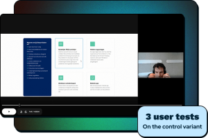
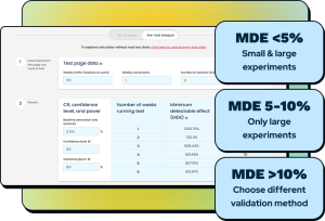
No traffic to test with. So I built a way to be sure anyway.
I calculated a minimum detectable effect and showed the stakeholder, in numbers, that an A/B test on this traffic would never reach significance. Then I validated another way: first, preference testing, twice, with iteration in between. Then a causal effect analysis: I measured the average conversion rate 13 weeks prior to implementation, and 13 weeks after. The week of implementation itself was not measured because implementation wasn’t done in one go.
Anyone can test when the traffic is there. The skill is a trustworthy answer when it isn’t.
Designed by summer. Live when the dev queue opened.
The research, design and two validation rounds were finished in the first half of 2025. Then the build waited on an external development team’s availability before it could go live. Because GA4 only retained two months of data and the launch date was outside my control, I copied the funnel baseline into Sheets in advance, so the wait could not erase the before-data I needed to prove the result.
More clicks, deeper scrolling, satisfied demand.
Built to ship, not just to look good.
The hard part of CRO is operating honestly when the data is thin.
The lazy options are faking rigour with an underpowered test, or dropping rigour and trusting your eye. The real work is a third path that is honest about its limits and still moves the business. That is what nine months of research, a defensible validation method, and a measured before and after bought here.
Every step: from discovery to solution

Let’s make something that works!
Tell us where your business is and where you want it to go. Brand, website, UX, or conversions, we’ll tell you how we can help. No sales pitch, just a straight answer.