UX / UI / CRO

B2B SaaS

Cierpa Kaizen

It explained everything. And sold nothing.

The Cierpa Kaizen page described every feature in detail, yet 83% of visitors left before they could answer the two questions that decide a B2B purchase: what is this, and is it for me. B2B SaaS product page redesign: Research, a full rebuild, and validation without a single A/B test took the demo click-through from 2.27% to 20.83%.

CLIENT

Cierpa, Kaizen software

MY ROLE

UX, UI & CRO, end to end

TIMELINE

Jan – Sep 2025

CONSTRAINT

Traffic too low to A/B test

THE RESULT, UP FRONT

+817%

Demo CTA click-through · 2.27% → 20.83%

+991%

On mobile · 2.50% → 27.27%

6

Research methods behind every decision

Measured over matched before and after windows (May–Jul baseline, Jul–Sep post-launch) using a funnel baseline I preserved manually. Traffic is low, so the rate is read alongside the mechanism behind it: deeper scrolling on every section and a measurable change in behaviour, both shown below.

BEFORE / aFTER

Same product. A page that finally explains it.

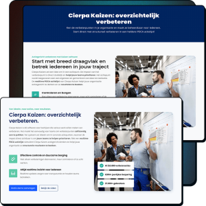
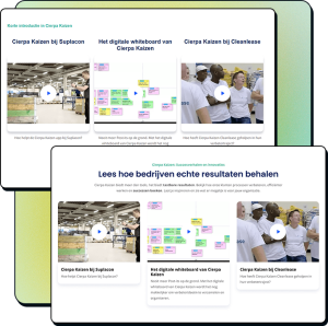
Our B2B SaaS product page redesign took the request demo CTA from 2.27% to 20.83%
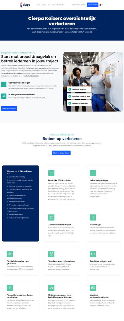
CONTROL

2.27% CTR

Feature-speak copy

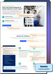
10 USP blocks

No product visible

CTA below fold
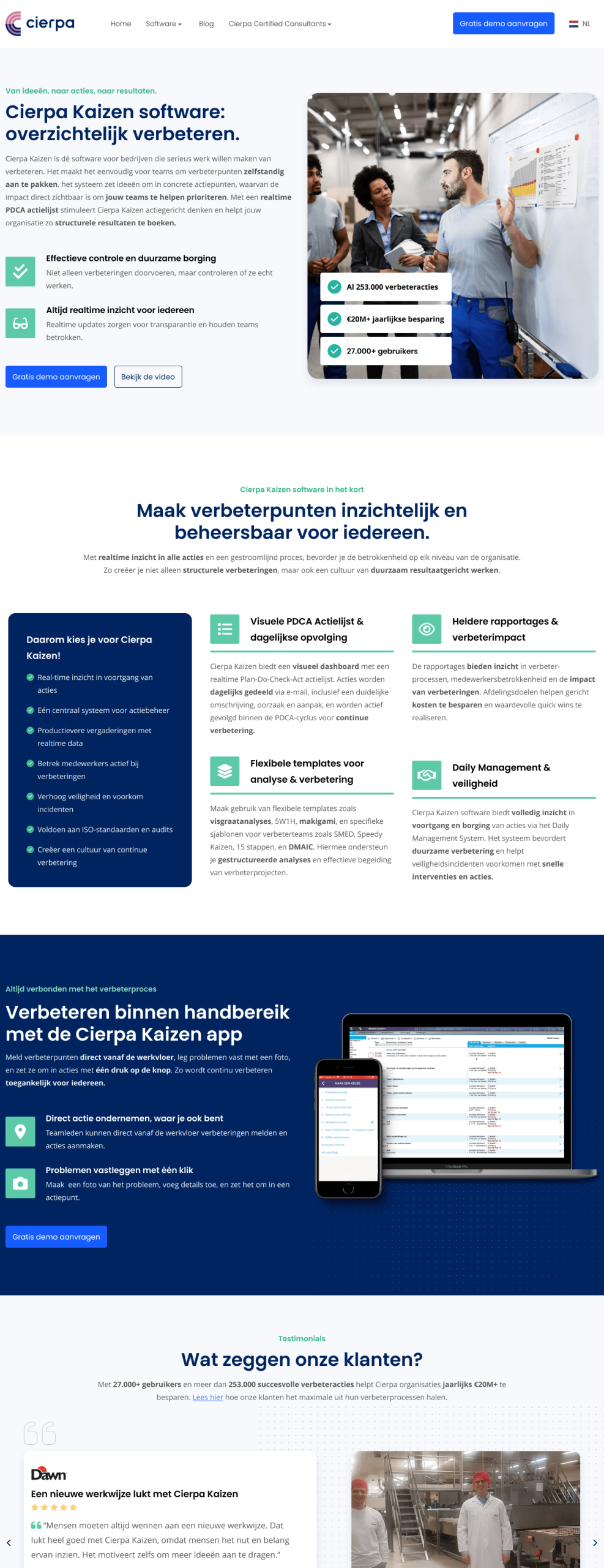
REDESIGN

20.83% CTR

Outcome-led copy

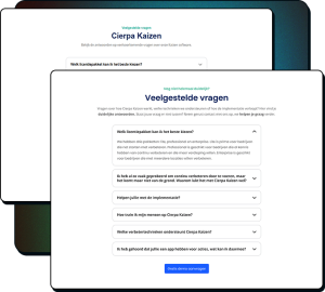
4 merged USPs

product shown

Demo CTA in first fold

THE PROBLEM

The page said too much, but explained too little.

Demo click-through sat at 2.27%. Research pointed at three causes, not one.

Unclear value

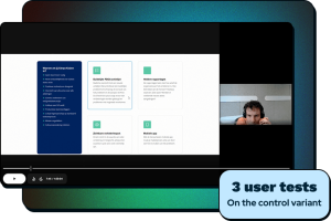
Copy listed what the software could do, never what a buyer would get. After reading the whole page, test users still could not say what Cierpa Kaizen actually was.

Nobody scrolled

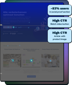
43% were gone before the USPs and 83% before the product demo near the bottom. The page lost people at the top, so nothing below it mattered.

CTAs missed

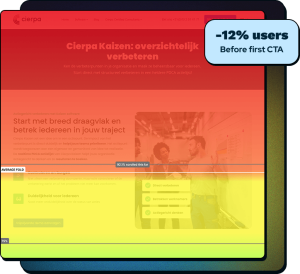
The primary CTA sat below the fold and 12% left before reaching it. The clicks that did happen clustered on an off-site video, a tell in itself.

RESEARCH

Six methods, one conclusion, before a pixel moved.

This was not redesign-and-hope-for-the-best. Every later decision traces back to one of these.

Scrollmaps

Mapped exactly where the page bled visitors, section by section.

Clickmaps

Revealed where attention and intent actually landed.

Session recordings

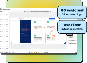
Watched real users get lost, scrolling up and down a wall of blocks.

Heuristic evaluation

Annotated every section against usability and persuasion principles.

Surveys

Confirmed the qualitative picture, low response as expected in B2B.

User tests

Quick runthroughs surfaced the core gap: all features, no outcomes.

Where the old page lost everyone

SOURCE: SCROLLMAPS · % OF VISITORS REMAINING

Before first CTA
88%
Before USPs
57%
End of USPs
43%
End of reviews
33%
End of packages
25%
End of demo video
17%
End of FAQ
10%
Bottom of page
4%

83% had already left before the product demo video near the bottom. Yet the few who reached it clicked at a disproportionately high rate. People wanted to see the product. The page hid it.

The insight that drove the rebuild

“You don’t buy a car when you haven’t seen it.” The clickmaps showed buyers hunting for product visuals deep on the page. The redesign brought the product up front, and a conversation with Cierpa’s owner confirmed mobile on-the-floor reporting was a defining feature that was buried in a single line of text.

THE SHIFT THAT RAN THROUGH EVERY SECTION

From what it does, to what it does for you.

The original page told users what Cierpa Kaizen does. The rebuild told them what they get. Same facts, rewritten to land.

Before · feature-speak
After · outcome-speak
Body copy read like an action list, “I can just use Excel for that”
“Tackle improvements independently and book structural results
“Request a no-obligation demo”
“Request a free demo” (lowers the barrier, free is explicit)
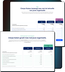
Pricing titled “Prices”, framed as cost
Flexible solutions for every organisation”, framed as value
Contact handled by “one of our staff members”
Handled by “our experts“, with the outcome spelled out
Submit button said “Send!”
“Request a free demo”, every CTA now matches

WHAT I CHANGED, AND WHY

Three decisions, not eleven sections.

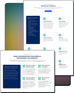
10 → 4

Cut the cognitive load

The “in short” section was 10 unordered cards. Recordings showed users scrolling up and down, lost.
I merged overlapping items into 4 grouped blocks, for example PDCA list plus daily email into one, reporting plus savings goals into one.

+ section

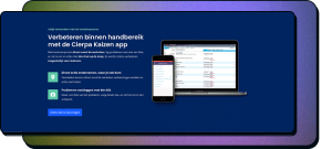
Show the product

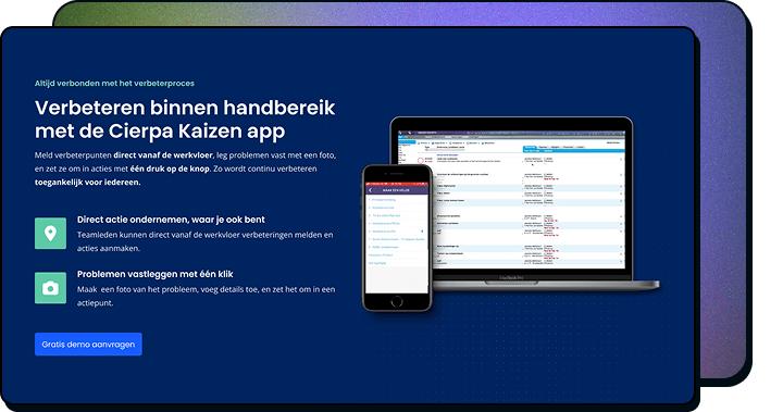
The mobile app was buried on the page. I gave it its own section with a device mockup, because the data showed people hunting for product visuals. Testing showed people now thought it was only a mobile app so a desktop mockup was added.

3 in 1

Create a reusable system

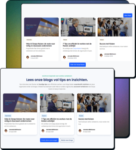
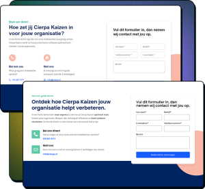
Hero, mobile and contact sections became a reusable component. Articles and blogs share the same card now. Blue reserved for CTAs only so they pop off the screen, semantic colours fixed, persistent form labels that don’t disappear on writing. Details that compound.

First test version showed a phone only and users assumed Kaizen was just a mobile app. I added the desktop next to it.
Second test, direct praise: “Beautifully designed laptop and smartphone section.”

VALIDATION WITHOUT A/B TESTING

No traffic to test with. So I built a way to be sure anyway.

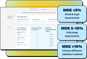
I calculated a minimum detectable effect and showed the stakeholder, in numbers, that an A/B test on this traffic would never reach significance. Then I validated another way: first, preference testing, twice, with iteration in between. Then a causal effect analysis: I measured the average conversion rate 13 weeks prior to implementation, and 13 weeks after. The week of implementation itself was not measured because implementation wasn’t done in one go.

TEST 1 · 40 PEOPLE · TOP 4 SECTIONS

53% redesign
47% control
Not significant · direction right, execution off
“When I scan the site, I still don’t know what the product is.”
“Too many boxes, it becomes boring.”
“Make it clear in 5 seconds what it’s about.”

TEST 2 · 40 PEOPLE · FULL PAGE

Redesign preferred
Statistically significant
“No endless feature lists, just highlights. Better to scan.”
“All the info to understand the business is in the first fold.”
“Very nicely designed laptop and smartphone block.”

Anyone can test when the traffic is there. The skill is a trustworthy answer when it isn’t.

HOW IT RAN

Designed by summer. Live when the dev queue opened.

The research, design and two validation rounds were finished in the first half of 2025. Then the build waited on an external development team’s availability before it could go live. Because GA4 only retained two months of data and the launch date was outside my control, I copied the funnel baseline into Sheets in advance, so the wait could not erase the before-data I needed to prove the result.

JAN – SPRING

Research

SPRING

Design & 2 validation rounds

20 MAY – 21 JUL

Baseline preserved while waiting on dev queue

29 JUL

Live

29 JUL – 29 SEP

Measured

RESULTS · 29 JUL – 29 SEP 2025

More clicks, deeper scrolling, satisfied demand.

Demo CTA click-through
Before
After
Change
Overall
2.27%
20.83%
+817%
Desktop
2.14%
15.38%
+619%
Mobile
2.50%
27.27%
+991%

Scroll depth by section

Before After
Hero
92.1%100%
USP
55.9%59.1%
Bottom of USPs
43%52.1%
Reviews
33%33.5%
Pricing
25%27%
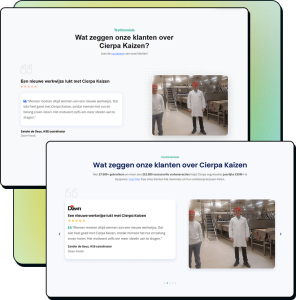
Social Proof
17%19.1%
Articles
13%14.4%
Bottom of FAQ
10%12.1%
Contact Form
8%9.3%

The biggest scroll gains land exactly where the biggest changes were made. Cutting the USP block from 10 to 4 lifted scroll depth there by 21.2% relative, logically as the section is much shorter now. The effect cascades: more people surviving the top means more reaching everything below.

The biggest win was silence.

Clicks on the off-site demo video and the screenshot blog post fell to near zero after launch. That demand did not vanish, it was satisfied earlier, on the page itself. Good UX often shows up as the absence of friction, not a new feature.

HAND-OFF

Built to ship, not just to look good.

Spec document

Every section with copy hierarchy, Figma design and dev-mode links, icon and asset references, and full FAQ content.

Visual guide

Anatomy and spacing breakdowns for desktop, tablet and mobile, so the developer never had to guess.

Responsive set

Three breakpoints delivered. Post-launch fixes were small and cosmetic only, no structural rework.

WHAT IT TAUGHT ME

The hard part of CRO is operating honestly when the data is thin.

The lazy options are faking rigour with an underpowered test, or dropping rigour and trusting your eye. The real work is a third path that is honest about its limits and still moves the business. That is what nine months of research, a defensible validation method, and a measured before and after bought here.

More is sometimes less

Showing off all features do not automatically make a product valuable for users. The original page wasn’t lacking information. Just none of it answered the question that actually matters to a buyer: “What does this do for me?” Shifting from features to outcomes ran through every section of the redesign.

Users want to see what they get

Show the product. We found users hunting for visuals of the software at the bottom of a page where almost nobody reached. They wanted to see what they were buying, and the page made them work for it. We brought that to the surface and the hunting behaviour disappeared. You do not buy a car when you have not seen it.

THE FULL PICTURE

Every step: from discovery to solution
CONTACT

Let’s make something that works!

Tell us where your business is and where you want it to go. Brand, website, UX, or conversions, we’ll tell you how we can help. No sales pitch, just a straight answer.

Name
Email
Message
Request sent successfully
There has been an error while submitting the form. Please verify your input.
Scroll to Top